Showing posts with label color schemes. Show all posts

Tuesday, January 22, 2013

Green & Gold Accessories


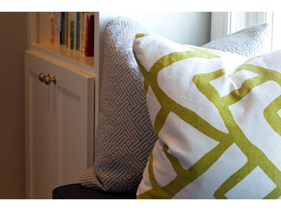
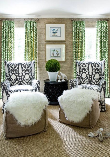
I have always loved green as you an read in this previous post and I am thrilled that emerald was selected as the color of the year.  It appears that all shades of green, not just emerald, are going to be big this year.  

I put together an accessory board to give you some ideas on how to incorporate a few pieces of the gold and green color trend.


I think green is incredibly easy to incorporate by simply adding more plant life!  Succulents and Maiden Ferns always improve a space.  You can also use accent pillows or any other type of accessory to bring in the green or gold.  I have been eyeing that chandelier for over a year now, it is one of my favorites!!

Wednesday, December 5, 2012

Idaho Project: Kid's Rooms

The Idaho Home Tour continues today with the bedrooms of my clients three children.  First, is their
two adorable little girls rooms.  These two girls are close in age and share a Jack & Jill bath.  I thought it would be fun to make their rooms different but make fuchsia the common theme.  After the girls rooms you will see photos of their son's room.  As you can see, I tried to carry a few similarities of the girl's rooms but with a different color scheme.  Enjoy :)

Room One


Room Two


Boy's Room


Monday, February 27, 2012

Tangerine & Lime Install Today

I installed a few pieces of furniture today into a home I've been working on the past couple of months.  I love the crisp colors of Tangerine and Lime and the pops of color it gives to this home.   I also appreciate that my client loves the way it turned out and said she would have never picked these colors if I didn't bring them to her.  It's always fun to bring someone out of their comfort zone!

This sofa has very clean lines with a curved camel back. 


I am obsessed with these dining chairs.  I've used them in black before and this warm brown finish is just as stunning.


This lime fabric is a great option to use as a solid because it has a nice texture to it and some shine!  It's perfect for a living room setting.  I used it as a small welt around the floral pillow as well.


This ottoman is my new FAVORITE!  I had it custom made to fit this Family Room.  I work with a lot of families so designing around children is often my biggest challenge.  I work hard to balance style and functionality.  This ottoman is my new solution for a family room coffee table.

Check it.....


That's right, it flips to a table top AND has storage.  Mom's out there are excited!  The minute I flipped it back to the ottoman their sweet little boy got right back on and started jumping :)
Everyone's happy!

-more pictures to come as furniture arrives

Have a great week!

Thursday, February 16, 2012

Silver Sage Dream

I worked on this lovely home about a year ago and haven't had the chance to take pictures of it yet.  So, while I was there today I quickly snapped a few photos.  I will take some more pictures as well as post the before and after shots in the next couple of weeks.


 I love this steamer trunk coffee table.  The aluminum mixed with leather straps is beautiful.


 The soft color palette mixes nicely with the raw woods.


Have a great weekend!

Thursday, January 19, 2012

Looking to fashion for inspiration

I'm knee deep in fabrics working on a few new color schemes and I am feeling so inspired by these images from Prada's 2012 Spring/Summer print campaign.  I love the classic tailored lines with playful prints.  I am drawn to the mix of bold patterns and rich jewel tones grounded by the soft blush, blue and green hues.  This is exactly the inspiration I have been looking for.  Thanks Prada!


Monday, January 16, 2012

Kelly Green

I tend to get obsessed with one particular color at a time and my newest obsession is Kelly Green.  I recently added it as an accent color in a client's home and haven't had the chance to really use and abuse it.  I love it mixed with strong hues as well as lighter more muted shades.  

kelly green
love it paired with animal print and navy


Pinned Image


296371_10150340436846011_218966791010_9974462_1851980_n[1]


293291_10150340437686011_218966791010_9974487_3828820_n[1]
the small green accent tray brings in a lot of color

294056_10150340436376011_218966791010_9974457_4250689_n[1]
the green chair becomes a focal point

looks great paired with soft blue

bdg style
This chandelier is stunning in person!


bdg style

Love these lamps!

Can't wait to use more of this color!


Tuesday, December 20, 2011

Finding Inspiration

I spent this cold California day in Los Angeles looking around for some much needed design inspiration.  I needed a breath of fresh air so I made a quick trip to the Pacific Design Center.  


The PDC is filled with designer furniture, accessory and fabric showrooms.

I spent a few hours getting lost in fabrics!  I am looking for something
different
unique color combinations, prints or patterns.....anything NEW and interesting!
(view of downtown LA)

After several hours and thousands of fabrics I managed to find some great new prints that I can get to work on creating new color schemes with.  I need NEW colors in my life!
Where do you find your inspiration?


Thursday, December 8, 2011

Color of the year 2012

The official "color of the year" by the Pantone (the world renowned authority on color) is:

TANGERINE TANGO


Dance into the New Year with this Vivacious and Appealing Reddish Orange

 Leatrice Eiseman, executive director of the Pantone Institute says:
Sophisticated but at the same time dramatic and seductive, Tangerine Tango is an orange with a lot of depth to it.  Reminiscent of the radiant shadings of a sunset, Tangerine Tango marries the vivaciousness and adrenaline rush of red with the friendliness and warmth of yellow, to form a high-visibility, magnetic hue that emanates heat and energy.”


Watch this video for some great Tangerine Tango fashion finds and for more information on Pantone...


Here are some ways to incorporate this blood orange into your home...
Pinned Image
via
Love the burst of color on these Dining Chairs with this neutral room.  


Pinned Image
via


Sep/Oct 2011
via
Add a bold accent wall or interior door...even your front door!


Adding a few new pillows or accessories is a great way to incorporate a new color into your home. 
Pinned Image


I look forward to pairing this hue with some unexpected colors like Amethyst or Emerald.  Or bringing it in as a pop of color to a neutral space. 
What do you think of this color?

Wednesday, December 7, 2011

2012 Color Forecast


Can you believe 2011 is coming to a close?  It was a great year in home decor, I loved the bright playful colors.  It appears 2012 will move into more nature inspired color palettes.  Things are warming up...our Honeysuckle of 2011 is deepening into a warm fuchsia.  


 Color Forecast for 2012
Neutrals
Neutral
Raw materials continue to influence color trends, especially the more subtle hues. Picture a field of grain, pile of pebbles, weathered wood and earthen clay. Gold tones embody the sun and soft metallics — and warm up this understated yet refined palette. Textural elements, such as linen, unfired porcelain and mixed woods, provide subtle tonal variations.


Reds
Reds
Red is the color of love, fire and the earth’s molten core, and it stirs raw emotions ranging from the deepest passion to the softest femininity. This saturated palette includes hues of brilliant flowers and glowing embers. It isn’t a single red, but a deep gradation of fuchsias, red-oranges, violets and delicate pinks.


Blues
Blues
This soothing palette celebrates a pair of functional and treasured blues: denim and water. It explores the darkest indigo to faded-jeans hues, some with violet undertones, as well as the calm, shimmery shades that reflect rivers, lakes and seas.


It is always fun to watch store fronts, like Z Gallerie, transition to the new "it" colors!  

Related Posts Plugin for WordPress, Blogger...