Thursday, January 31, 2013

Living Room & Family Room Portfolio

You may have noticed I am making some changes to my blog.  I am trying to get everything organized so it will be easier to look through.  Please bear with me if you have seen these projects in the past!!  The only way I know how to categorize is to post it.

Belmont Design Group
Family Room & Living Room Portfolio
Natural Linen, Spring Green, Crisp White with Bright Pink Accents

Mustard, Turquoise, Crisp White with Fuchsia Accents

Silver, Charcoal and Gray Blue

Black & White with Linen

Neutral Palette with Rustic Elements

Turquoise, Tangerine, White & Linen

Gray, White with Navy & Apple Green Accents

Black & White with Bright Yellow, Turquoise & Plum


Plum, Navy and Rich Green

Gray, Turquoise & White

Soft Blue & White

Warm Browns with Turquoise and Coral

Wednesday, January 30, 2013

Style on a Budget

I was in Target yesterday and was loving some of their new home accessories.  Their fun selection of lamp shades really caught my eye.  How cute are these? 

There are so many great lamp bases to choose from too. Some of these would be cute in a kids room!  I think #4 is my favorite with the tailored white trim on top and bottom.  
Target has really come a long way!

Monday, January 28, 2013

My Favorite Window Treatments & Tips

Custom Window Treatments can be pricey!
The labor involved and the amount of fabric required really add up.  They also need to have lining and whatever type of hardware needed per treatment.
However, they are a beautiful addition to any space and well worth the investment.
I put together a little round-up of my favorite window treatments I designed the past couple of years.

This kravet fabric is one of my favorites!  I love the way it works up as a simple grommet style panel.

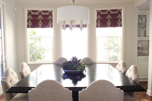
What I love about this stacked roman shade is the fact that it brings in the splash of color this neutral dining room needed.  The print is gorgeous it adds to the simple elegance of this dining room.

This simple roman shade in white with a solid color band looks clean and simple but brings in a splash of color.  I love all things that contrast and this roman is a favorite!


This roman works so great in this nook area because the room really needed a print and color.  With the wood table, chairs, buffet and flooring, the patterend fabric really softened the space.

This Schumacher print is also a long time favorite.

Not everyone can afford to bring in custom treatments but there are so many great semi-custom shades and panels on Etsy that can give you the look for less.  I have used pre-made treatments in many homes and they also add a beautiful touch. 
Take the time to look around at different options.  Also, be sure and check out this popular post on Drapery tips.
Have a great week!

Tuesday, January 22, 2013

Green & Gold Accessories


I have always loved green as you an read in this previous post and I am thrilled that emerald was selected as the color of the year.  It appears that all shades of green, not just emerald, are going to be big this year.  

I put together an accessory board to give you some ideas on how to incorporate a few pieces of the gold and green color trend.


I think green is incredibly easy to incorporate by simply adding more plant life!  Succulents and Maiden Ferns always improve a space.  You can also use accent pillows or any other type of accessory to bring in the green or gold.  I have been eyeing that chandelier for over a year now, it is one of my favorites!!

Friday, January 18, 2013

STYLE WATCH

I have written in the past about how my color schemes are often inspired by fashion.  I prefer Fashion Magazines to Home Magazines any day!

Here are some images that have been inspiring me lately. 
Valentino Resort 2013
via- Valentino Resort
 {Green}

Michael kors resort 2013
via-Michael Kors
{Metallic!!}

Fashion flock #streetstyle
{Bold Prints}

ChloƩ S/S 2013 - PFW
via-Chloe
{Structure}

Derek Lam Spring 2013
via-Derek Lam
{Colors}

I love the rich fabrics in these pieces. These photographs inspire!

Have a great weekend!!

Wednesday, January 16, 2013

The Chair with a funny name

I don't know why but the word chaise is one of those words that I just don't like to say.  Its not as bad a moist but I still don't like it. Ha!
No matter the name, I still love this piece of furniture and think that it is highly overlooked.  It's not a sofa and its not a chair...it's somewhere in between.  I think these pieces are so comfortable and in the right setting can look so unique and special.

 This Master Bedroom Retreat was the perfect spot to use a stylish chaise. It filled the space perfectly and this client loves to snuggle up with her babes in this cozy spot.


I put together a collection of chaises that you can find at some of the popular retail stores.  They range in price points but I think they are all stylish.


3.  West Elm
5. & 6.  Ballard Designs
7. & 8.  Layla Grace


I think the chaise works great in a Master Bedroom or any space that you want to have a little corner reading nook.  They look great paired with a little side table or garden stool.
Something to consider :)

Tuesday, January 15, 2013

My New Obsession

Hello, Beautiful.

Look at those lines...I love this chair (minus the fabric).  

I am planning on re-upholstering this beauty as soon as I find a fabric that will work in my new office.
I am on a mission to design our new home on a budget and with interesting pieces. 

Which leads me to my new hobby...I have always loved antique shopping, looking for stylish vintage furnishings is a rush!  Especially, when you find something you love and the price is CRAZY good! I am incredibly motivated {obsessed} with searching for pieces to use in our new home.  I have plenty of time so I am exploring all furniture options.  

I am counting down until The Marbuger Farm Antique Show on April 2nd.

There are over 2500 vendors on a 43 acre field in the small town of Round Top, Texas. Have any of you been to this?  
I Can't wait!  I better start saving!!

Monday, January 14, 2013

Monday Inspiration

Hello Readers.
I hope you all had a great weekend.  I have been busy taking care of my boy who has the flu BAD!  It is horrible...I don't think he has ever been this sick.  Needless to say, I am exhausted.  I hope you are all feeling good and manage to avoid this flu going around!!  I am downing Vitamin C like crazy!
  
Today, I am featuring a Design Board put together using only affordable pieces.  The Nightstands are a great size and only $52.00 (say what?) and the upholstered headboard...$150 for a full!  

Today's Guest Room features rich fabrics and stylish yet affordable furnishings...
I used the following pieces to create this space:
Paint:  Benjamin Moore Moonshine

When working with a room on a budget I pay close attention to the scale of the pieces.  Always check the dimensions of each piece with the space you plan on using it in.

Have a great week!!

Thursday, January 10, 2013

Jack's Map

Even though we are moving into our permanent home in 8 months I was feeling a little restless with all of the bare walls around our current place.  I wanted to just add a few things so it felt more like home. It's hard to do with most of our things in the garage and we sold a lot of what we had in California (trust me, I'm not missing it) so, I decided to get a couple of things. I only wanted to purchase things that we will use when we move.  I noticed this oversize wall map at IKEA and loved it!  It is huge!  This map covers so much empty wall space I am happy we added it to his empty room.  He loves it too.  We find ourselves referencing it a lot when they ask about different places.  Artwork with a purpose :)

Jack's Map
My guy.

Pillow and bedding is from Homegoods.  Seriously, his room is not even put together but I'm at least moving in the right direction!!


The lighting was off so I was unable to get an overall shot but you can tell by the bed, which is a queen, just how big this print is.  I think there is some great "boy room" colors in this print that I look forward to adding to his room!  I guess I have 8 months to decide on which color to paint his walls :)

Tuesday, January 1, 2013

BDG STYLE 2012 Project Re-Cap

HAPPY NEW YEAR!!
This year has been filled with big changes for me.  We moved our family and business out of California and landed in Austin, Texas.  It has been so great for us but also a huge transition.  We love it here but I miss my friends like crazy and not living close to my Mom is much harder than I thought it would be!   Even though I am transitioning, I know we are right where we need to be.  This is a great place to live and my kids are in heaven!

There have been some exciting changes personally but also many exciting things career wise.  A big highlight was having a picture of one of my projects in HGTV Magazines WOW What Color Is That series...click here to check it out.  


I also completed several projects this year.  Probably the most I have ever worked on while working for myself.  I thought I would re-cap my 2012 projects for you to see in case you are new to BDG STYLE or just missed the following posts.....


2012 Belmont Design Group
 Project Re-Cap

Sadly, I never took AFTER pictures of this project. I was waiting for back-ordered items and never got back over there once it was completed.  I turned this house from a dark Tuscan interior to a comfortable modern interior.


This was a dream project that I started in late 2011 and completed this year.  I was able to get this home ready for this family while they moved from Northern California to Southern California.  I was obsessed with this home!  It was also fun that this client found me via this blog!
To view ALL of the rooms from this amazing home click the rooms below...
Dining Room, Family Room, Kitchen, Master Bedroom, Office & Guest Room


For this home, I added new Living Room, Dining Room and Family Room furniture.  The Tangerine and Lime scheme is so bright and colorful, I love it!


I added dining room and living room furniture for a friend of mine who moved from Chicago to Ladera Ranch.


I finished most of this project in 2011 but added art work and a few other finishing touches this year.


Another project I forgot to take completed pictures of!! Annoying!  Anyhow, I added Family Room furniture, a nook table and chairs as well as entry furniture.  It turned out great...wish I could share more!


I am currently still working on this home.  We have added so mush since I took these photos...In a couple of months I will post the completed pictures from this home.


Love, Love, Love this home.  Fresh and Modern Traditional filled with Jewel Tones....its a fun mix of colors and patterns.
To see more of this home...
Living Room, Dining Room, Kitchen, Family Room and Powder Bath


I added furniture to the Family Room and misc. items to other rooms in this lovely home.  We also changed the paint colors which changed the whole feel of the home...I love the juicy colors!


In October, I changed this room from an adorable girls room to this fun boys room.  The entire room was based around that front chevron pillow that I found at Homegoods!  To see the before pictures click here.


This Kitchen Re-Model is the biggest transformation I think I have EVER seen...Check out the BEFORE here.
I love the other rooms in this home.  If you would like to see them all click the rooms...
Family Room and Nook, Playroom, Girls' Rooms and Nursery


This home was from my recent posts of the eDesign Project I worked on in Idaho.  LOVE everything.  This home is incredible.  Check it out if you missed it...
Great Room & Dining, Kitchen, Office, Master Bedroom & Bath, Kids rooms, Laundry , Details


In November I flew back to California to install this home.  Unfortunately, my camera had a dead battery so I was unable to take pictures.  On my next trip out there I will take pictures of everything so I can share.


I updated this colorful girls room.

In between these projects I also worked on a couple of office spaces and little things here and there...again, no photos!! ugh!

I had fun compiling this list and I have so many fond memories of these projects.  Each client was amazing to work with and it was wonderful getting to know their families!  I have learned a lot...for instance, bring along the nice camera!!!  It's so big and bulky and I shot way to many of the above homes with my iphone.  I also learned to hire help!  I have a great support team work wise (a book keeper was a mandatory addition this year).  I really look back and regret not having more help on the personal side.  With kids and home responsibilities, I was drowning...to put it lightly.

Moving into 2013 I have made several goals for myself work wise.  I plan on changing up my look slightly.  I am really into straight line mid-century modern right now but with my own twist. Adding more tone-on-tone color pallets with deep color accents is where my mind is.  I am feeling my overall style changing and I hope that I get to work on a project where I can create this look.  Maybe it will have to be my own home!
Who knows what 2013 will bring but hopefully it brings much happiness to you and yours!

Happy New Year!!!

xo,
Alison

Related Posts Plugin for WordPress, Blogger...