Friday, September 30, 2011

CHANDELIER LOVE

Our San Clemente project is moving right along.  This "flea market" style chandelier was just installed in the dining room and really sets the tone for this room.  The dining table has a zinc top and the chairs are a soft linen.  I love that this chandelier pulls the blue we have throughout the home into the dining room in an unexpected way.  


More pictures coming soon! 

Have a great weekend!


Wednesday, September 28, 2011

GREAT RUG

I just got a PB Teen catalog and I loved this rug so much I thought I would do a quick post about it!

The modern colors of this Kilim style rug are so striking I can see this in a funky home office, a girls (of any age) room, playroom or even a family room.  
via


also comes in this color way....


$269.00 for a 5x8 is a steal!

Monday, September 26, 2011

PURPLE DECOR

My Mom just brought me this beautiful Italian Home Magazine from her recent trip to Italy.  I am feeling inspired!

Almost every room has Purple in it......next big thing?!?
Purple has never looked so good!  Images of Purple and Coral, Purple and bright orange and reds.....yum.


More Purple Images...


Suzie: Kemble Interiors  Sara Gilbane  tan fuchsia green bedroom design with linen camel back ...
via


This week I am in search of the perfect purple color scheme.  Soft linen and white, touches of coral/orange and a splash of amethyst....I can see it now :)


HAVE A GREAT WEEK!


Tuesday, September 20, 2011

JUST DELIVERED

Snapped a few photos with the camera phone today of some new products I just installed at my client's home.  Just a couple close ups until we get everything installed.
 waiting on the coral pillows to complete the color scheme.

 beautiful geometric jute area rug in the family room


Can't wait to show you the rest of the home as soon as it all comes together.  Especially the gorgeous kitchen!


more to come....


Monday, September 12, 2011

DESIGN TIP: SELECTING PAINT COLORS

Where to begin.........
Selecting paint colors for your home can be overwhelming!  
I think deciding on a wall color is just as hard as finding the color you decided on!  Here are my top ten design tips to hopefully help you in your next painting endeavor!

photo: Alison Royer 
1.When re-modeling selecting your paint color should be the LAST thing you do NOT the first.
 
2.  Try not to blindly walk into a paint store and pick a color because you like it (you might not when it is on the wall).  Instead, find fabrics or artwork around your home that you like and place the paint chips next to the color in the fabric or art.  It will help you pull out the color you are most drawn to.


{For this room I selected a green wall color from the lighter shade green in the pillow fabric.}
photo:  Ashlee Raubach
interiors: Belmont Design Group
3.  Consider how the color will look in the lighting of your room.  Natural daylight shows the truest color.  Incandescent lighting brings out warmer tones and yellows.  Fluorescent lighting casts a sharp blue tone. 
 {This is where painting a sample on the wall is especially helpful}


via
4.The paint colors you chose should complement the room's permanent features, such as fireplaces, cabinetry and flooring.  Hold paint chips next to all of these permanent fixtures to be sure the colors do not clash.

5.  When selecting several colors it is nice to select tones that flow nicely together from room to room. 
photo:  Alison Royer

6.  Think beyond traditional colors for rooms.  
i.e. girls (pink) and boys (blue) 

MarineWeathered Coral
PersimmonWharf
-via

7.  Play up monochromatic schemes to create a soft variation. 
 Layer colors.
{I wanted this Master Bedroom to feel calm and cool with an interesting focal point.  The soft gray paint layered inside/outside the moldings added a simple and soft backdrop}
photo: Ashlee Raubach
interiors:  Belmont Design Group

8. Use high quality paint.  My standard favorites are Benjamin Moore and Sherwin Williams.  Farrow and Ball and Serena and Lily are also amazing!  The quality does make a difference!
9.  Cool colors make a room feel larger and warm colors make a room feel smaller.


10.  Get creative!
Accent walls, stripes (mixing high gloss with flat in the same shade), etc.
After all.....paint is easy to switch out :)

Tuesday, September 6, 2011

MODERN RESTORATION

I hope you all had a great Labor Day weekend and enjoyed the last weekend of summer! 

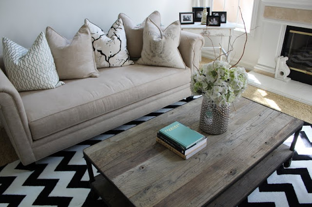
I posted some other pictures from this black, white and turquoise home here.   The style of this Living Room is a combination of the Restoration Hardware look with chic Modern elements.....Modern Restoration?!  I added two linen sofas to keep with the style of the existing cocktail table, modern prints on the accent pillows and the striking chevron rug.  The tall black mirror also adds a splash of interest to the tall ceilings and white walls. 


-all photos by Alison Royer for BDG Style


Thank you to those of you who have added BDG Style to your blog roll! Please email me if you have and I will be sure to add you to mine.
Have a great week!


Related Posts Plugin for WordPress, Blogger...